Thursday, April 29, 2010
Tuesday, April 27, 2010
Tuesday, April 20, 2010
Thursday, April 1, 2010
Final Project Proposal
1.Concept (what and why)
Visual concept: person with wings in a fantasy-scape/dream scene, possibly a transformation of a drawn character into photo-realistic subject
Psychological concept: human identity, physical reality
A progression of series in a line- as the world deteriorates, the person becomes more complete then the reverse
Experimental visual techniques:
black and local color
multitude vs solitude
bending cliché/ darker themes
2.Production Process (how, where, when)
Some images taken from the internet, hopefully most taken by me with the digital camera. Most images of nature scenes, maybe some city-scapes and people.
3.Post-Production Process (what kind of editing)
Mostly color, blending, smoothing and blurring of different images to hopefully form seamless and somewhat believable scenes with a focus on atmosphere, perhaps w/ a cinematic effect
4.Final Output (number of images, size they will be printed at)
total of about 4 photos, no bigger than 7 ½ X 10, possibly making changing the size as they progress from picture to picture
5.Influences ( Historical and Contemporary- who else has done this and how can you expand on that)
These artists create either visually stunning, fantastical images or focus on atmosphere and mood.
William Kentridge, Jerry Uelsmann, Patricia Van Lubeck, Andreas Gursky, Matthew Ritchie, Gregory Crewdson, Kim Keever, Yoshitoshi ABe
Production schedule
Thur 15th Rough sketches of final pictures
Tue 20th- Contact Sheet of 20 images
Thur 22nd – Narrowed down to 6 photos, rest of images needed gathered
Tue 27th- two rough edits by end of class
Thur 29th- 4 rough edits by end of class
Tue 4th- 6 rough edits by end of class, presented to Todd
Thur 6th- Final Project
Monday, March 29, 2010
Thursday, March 25, 2010
Wednesday, March 24, 2010
Composite Ideas
I'd like to try something where I compile images of nature, such as flowers or trees in unexpected places, such as in an indoor room on a roof. I'm really fascinated with the contrast between combining the exterior world with the interior, rather than trying to make a political-type statement, although this idea is not set in stone as of yet. My other idea would probably be a kind of statement about identity as well, as this also fascinates me. My goal is really just to create something aesthetically interesting.
Thursday, March 4, 2010
Comments on Katie's Photos
I think her narrative is about life on a farm in small moments. I really like the quiet atmosphere created by the lighting and the winter landscape. It was really hard to choose just five images I thought were the best, because each one seemed to have it's own story and say something significant. Photos
The first image I liked was the one of the bird. It really captures the mood of the narrative and the colors are soft and subtle and seem to match the sense of winter really well. The colors are great, so I think the only thing I would work on is creating more of a depth of field. As a viewer, I feel like the image is a bit flat. Perhaps try cutting off below the railing.
The second image I liked was the picture of the room inside the house. This helps give a sense of who might live there, even though we never see the person. There's a quiet atmosphere despite the clutter of flowers, food and pictures on the wall. Perhaps the photographer can try and play with the different color structures in the room. Also maybe thinking about experimenting with the light coming from the window as it seems a bit too bright.
The third image I would choose is the one with the cat in it behind the wall. I liked the one with just the cat, but I think capturing the environment the cat is in creates a really nice moment. The composition is nicely divided between the wall, the shadows, the cat and the tailor behind the wall. I think the blue and orange color compliments work really well. I would think about maybe cropping out the left side as it kind of distracts and doesn't really fit in with the rest of the photo. I'd also think about playing with the light and contrast.
The fourth image I would choose would be the one with the horse licking the fence. I also think this is a beautiful moment that interests me because it gives a kind of personality to the horse, much like the bird and the cat. Perhaps think about experimenting with the lighting of the background, as it seems a little washed out.
The fifth image I would choose would be the one with the broken fence and the tree behind it. There's a great landscape created there, with the white, pure-looking snow covering the ground. The soft, but luminescent light (and the equally as soft tree shadow) also contributes to the sense of time in the photo. Maybe thinking about making a kind of symmetry with the fence could be interesting. Darkening the shadows could also be interesting as well. Like with any of these, it might also be interesting to see them as as gray scale photographs, especially this one.
Although there were others I liked just as much, what I took from the series is that because there was only one photo with a human being in it, the photo was not really about people, but a lifestyle and the environment. If a person is part of the narrative, then it's the person or people who notice these moments as the viewer sees them.
Tuesday, March 2, 2010
Documentary Narrative
My idea is to do something about personal identity and how it's changed by popular media in the form of one's physical appearance and material obsession- a somewhat cliche narrative, but I liked the idea. The story is of a girl who feels confident as herself in comfortable clothes. She comes across popular media, which influences her way of thinking about herself. She tries to fit these idealistic images, but becomes unhappy at the change of physical, even personal identity and loss of self-confidence. My influences came from a video I saw about a digital robot who watched commercials and runway shows of models and desperately tried to change itself constantly to fit the images of "perfection." In the end it broke down and literally destroyed itself, which is a fascinating psychological idea to me, though I know I can't quite create nearly as cool a narrative. Contact Sheet I do want to experiment a bit with photoshop effects to create an atmosphere and to get the emotions across, though.
Thursday, February 25, 2010
Wednesday, February 17, 2010
Influences and Panoramic Idea
Tuesday, February 9, 2010
Comments
Megan's Photos:
I like photos of the branch and the leaf dangling from it, the one with the fluffy weed next to the water, and the one with the tree in the middle of the fall leaves. From looking at her influences, I can really see where her objects of interest and her organization of composition come into play in her photos.
The one with the branch and leaf really emphasizes the foreground by blurring out the background. The line that separates the foreground objects is which helps make the foreground/background distinction clear.
The one with the fluffy weed next to the water is beautiful as well. Not only in terms of color, because I can also see how it is a foreground/background picture. The hard edges mixed with the soft edges makes for a very balanced composition. The soft blue/green and light, illuminated brown of the weeds makes the photo a simple, natural piece and brings forth a very calm emotion.
The one with the tree and the leaves has its own sense of calmness too. The leaves are a very rich color, which I'm incredibly drawn to. The placement of the tree in the near center of the photograph really bears down a sense of weight as well, so compositionally it's a great piece. The tree even seems to reflect the color of the leaves and I can really get a sense of the natural, vibrant light.
Charlie's Photos:
I really like number's 2, 4 and 9 the best.
Photo number 2 has a great sense of rich color as well as an intricate balance between negative and positive space. The straight lines juxtaposed to the curves make for an interesting composition.
Photo number 4 really expresses the sense of the depth of field. Even though the objects in the front are slightly blurry, it allows the viewer to gain a sense of depth because of that difference. Here, too, the negative and positive space really plays a large part in composition.
Photo number 9 really shows the sense of flatness in the wall. The sense of sharp and soft lines as well as the negative and positive space between them really shows. Both the subtle changes in color and the vast changes in various places really keep the eye moving across the photo.
Thursday, February 4, 2010
Influences
Here are some photos that I love to look at and take similar kinds of photos. As you can see, I tend to really like photos of the natural world, particularly the ones that lean to a kind of fantastical or grand scale. I'm drawn to photos that emanate a sense of natural power, but I also appreciate those with a quiet kind of "frozen-in-time" sense as well.
I like Larry Fuchs Reg Moore and Liza Dracup for their use of rich color in their photographs.
Some natural world photographers I like are Joe Cornish Ben Messina Peter Hill and Richard F. Liotta
sky
sunlight
mist
clouds
flowers
waterfall
canyon
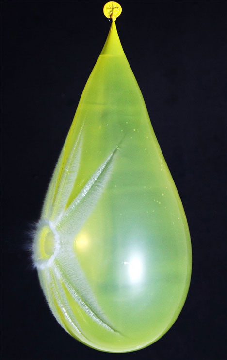
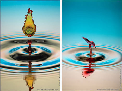
I've also quickly become attracted to high speed photography and photographers like Michael Klimas
egg
waterballoon
I also find more abstract photos to be pleasing.
water
I like Larry Fuchs Reg Moore and Liza Dracup for their use of rich color in their photographs.
Some natural world photographers I like are Joe Cornish Ben Messina Peter Hill and Richard F. Liotta
sky
sunlight
mist
clouds
flowers
waterfall
canyon
I've also quickly become attracted to high speed photography and photographers like Michael Klimas
egg
waterballoon
I also find more abstract photos to be pleasing.
water
Subscribe to:
Posts (Atom)